Asia Initiatives is a not-for-profit organization based in New York which supports women and under privileged communities in the US, Asia & Africa.
goal
Develop an easy to use ios/ android wallet app for marginalized communities and project managers to earn and redeem SoCCs (Social Capital Credits)
Establish digital strategy and brand guidelines to deliver a cohesive experience. And create graphics and collateral focused on growth and program awareness.
Role - UX Designer/ Researcher
TIMELINE - Sept 2018 - 2021
Tools - Illustrator, Photoshop, Adobe XD
client - Asia Initiatives
APPROACH
Employed the design thinking process to empathize, define, ideate, prototype & test solutions for creating an effective wallet app. The process was carried out in the following phases product definition, research, analysis, design & validation.
UNDERSTANDING THE USER
user RESEARCH
DISCOVERY PHASE RESEARCH - We got a mandate from our stakeholders to critically analyze the methodology in which all the projects were carried out on site and see if there was any need to streamline the process through a digital platform. We decided to conduct an initial in-depth research using qualitative methods to understand what was the current process across different projects for earning & redeeming SoCCs, communication between participants and SoCCs manager, figure out the end users, specific difficulties encountered during a project timeline and verify the potential usability of a digital platform.
The graphic below shows how the existing flow looked like. And after conducting an initial round of interviews, secondary research and surveys, below were our findings :
•There was a potential opportunity to incorporate a digital platform between step 2 to step 4.
•The primary end users we had to consider were participants and SoCCs manager.
•An opportunity to integrate our digital literacy program into the existing programs.
•Will help in digitizing the data across programs for easier access and will help inform future projects.
Old framework of projects
Example of SoCCs menu
Example of SoCCs process
Hence, after intensive research and careful consideration we decided to build a framework for an app that could serve as platform for each project to host their individual earning and redeeming menus. As the product was still in the brainstorming stage, we decided to conduct a foundational research to empathize with users, understand their needs, and inspire new design directions and priorities. Hence we used interviews & surveys as research methods to conduct foundational research based on qualitative observations. This helped us discover the following pain points:
1 The existing process at the time used physical documents to record SoCCs transactions and hence both participants and SoCCs manger had hard time keeping track of the progress.
2 Users had Android phones with less space which meant that the app size had to be minimal.
3 Needed in person updates on new activities or program learning materials.
4 Every community conversed in different language and required the program to be setup accordingly.
5 Difficult to increase the number of participants in programs due to burden on limited resources such as manpower, time and budget.
6 Lack of regular check ins to provide feedback or ask questions.
7. Hard to keep a track of events and activities happening around, this needed the participant to travel long distance to check in with the local manager.
8 Hard to access programs which are only available at nearby resource centers.
Personas
Based on the research insights and pain points, there were 2 main end user personas that the app needed to solve the problem for, Participant and the SoCCs Manager. The idea was to understand users within their social, emotional and physical context and which is why we developed these below personas.
goal statements and USER JOURNEY MAP
Creating personas helped to draw up goal statements to clearly define user needs that needs to be addressed. And based on goals we created short user journeys specific to their goals. This helped to get a better understanding of how the user felt while trying to achieve their goals, like the one below.
Design
SITE MAP
At this early stage, the information architecture of the website had to be organized to help users understand where they are in a product, where the information they want is, how much control each user has over the app data. And to do so, we created page components for both the interfaces for participants and SoCCs manager. For example, refer the participant interface below.
participant Interface:
1. Login
•Phone number
•Password
•Forget Password
•New User
2. Register New User
•Enter Ten-digit mobile Number
•Send SMS with code
•Register when correct code entered
•Setup password
3. Setup Profile
•Name
•Address
•Gender
•DoB
•Family Size
•Email (Optional)
4. Select Project from drop down list
•Enter code for project
•Register for project if correct code entered
•Project Added successfully
5. Individual Home Page
•My Profile
•My Projects
•My Messages
•My Calendar
•Help
•My SoCC Manager
•My SHG
•Earned SoCC Points
•Redeemed SoCC Points
•Upcoming Activities
7. SoCC Star: A user may be deemed SoCC Star and it would be decided by the local Partner. This should be an in-app notification with a new redeeming item added to the menu- specific to user. This notification may have music/congratulatory graphics etc
iconography
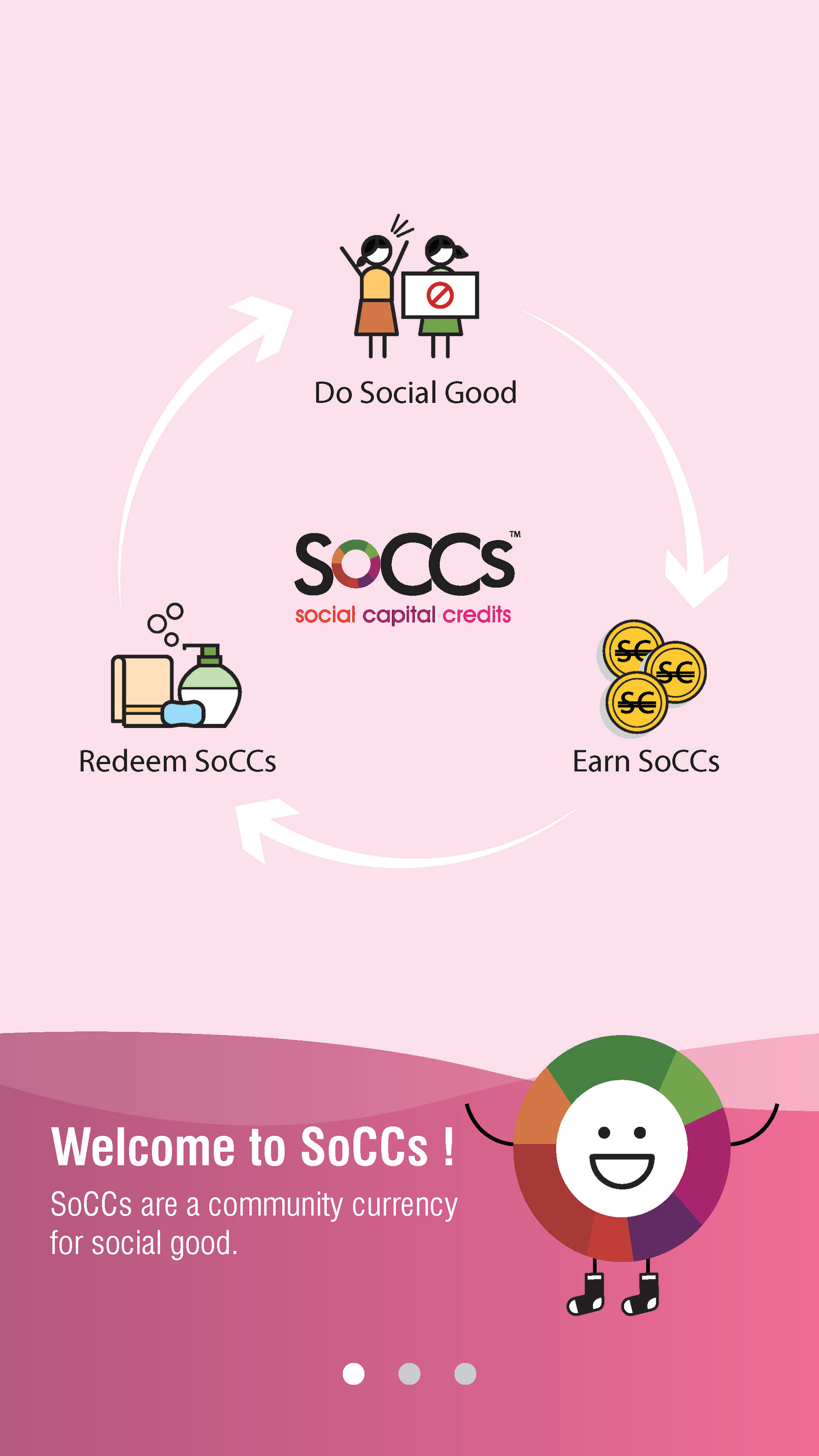
As the activities included in the app were unique to projects and needed to convey a strong message of women empowerment and depict clear visuals, we developed new icons from scratch for initiatives and earning and redeeming activities.
HI FI MOCKUPS
With all the graphics, iconography, typography, color scheme set in place, we started the creating screen mockups based on our sitemap and detailed all the components with our UI kit.
Landing Screen
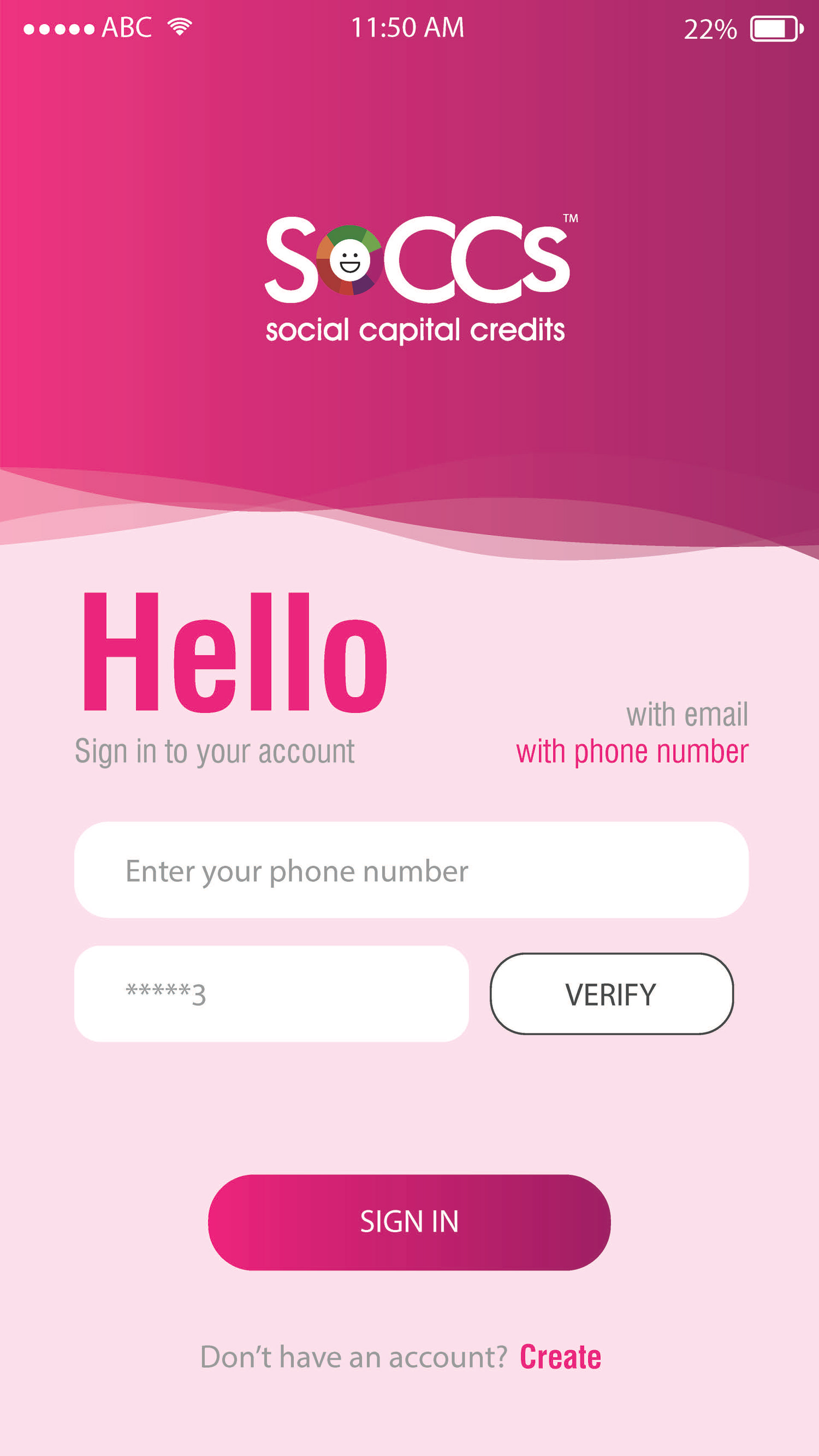
Login
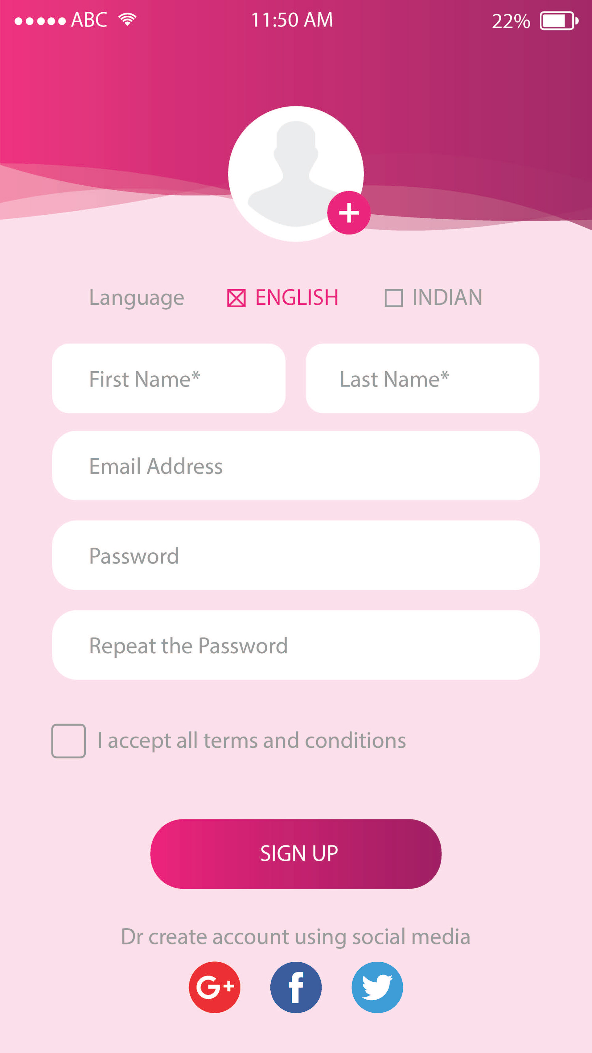
Register
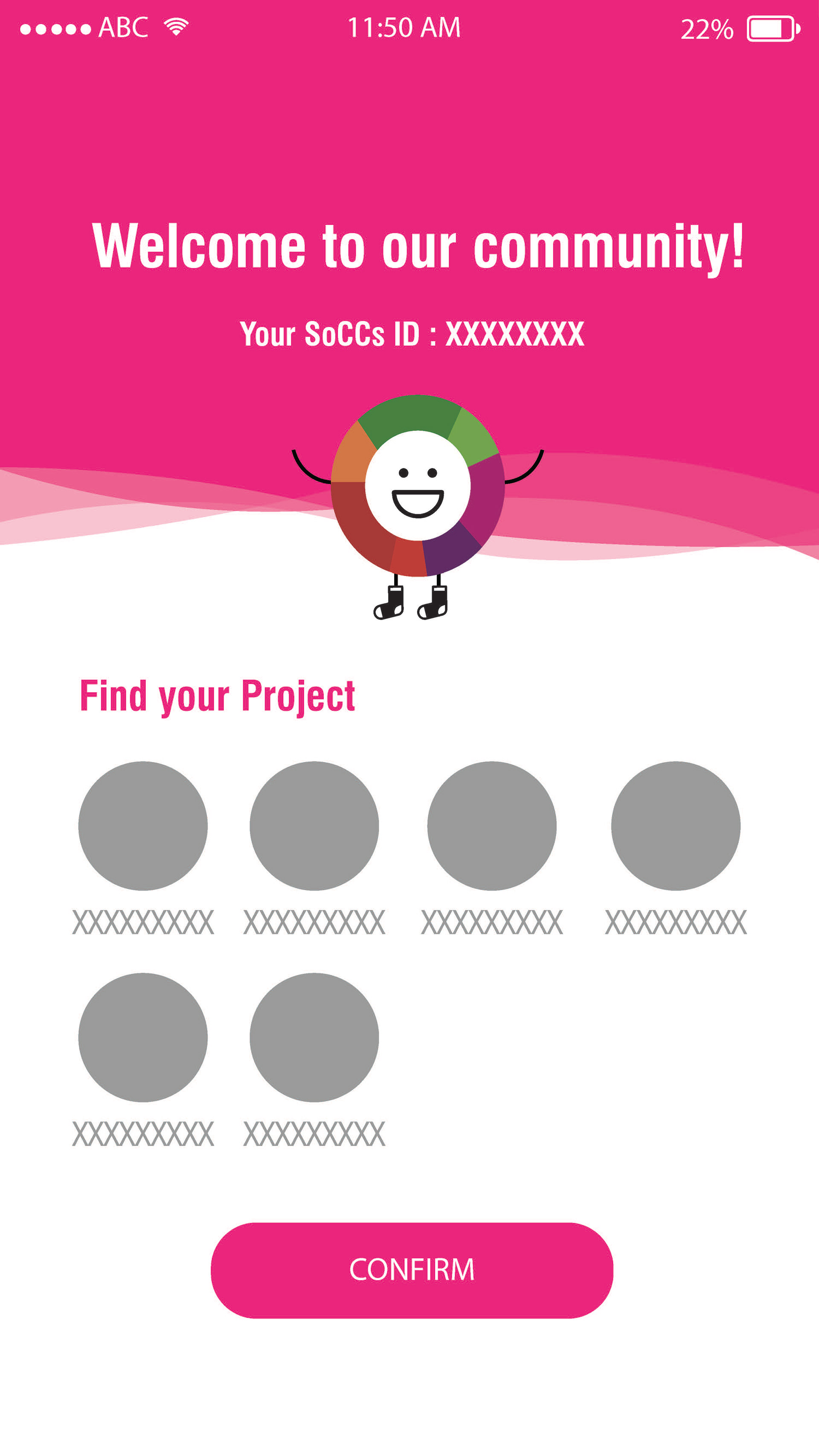
Project Selection Page
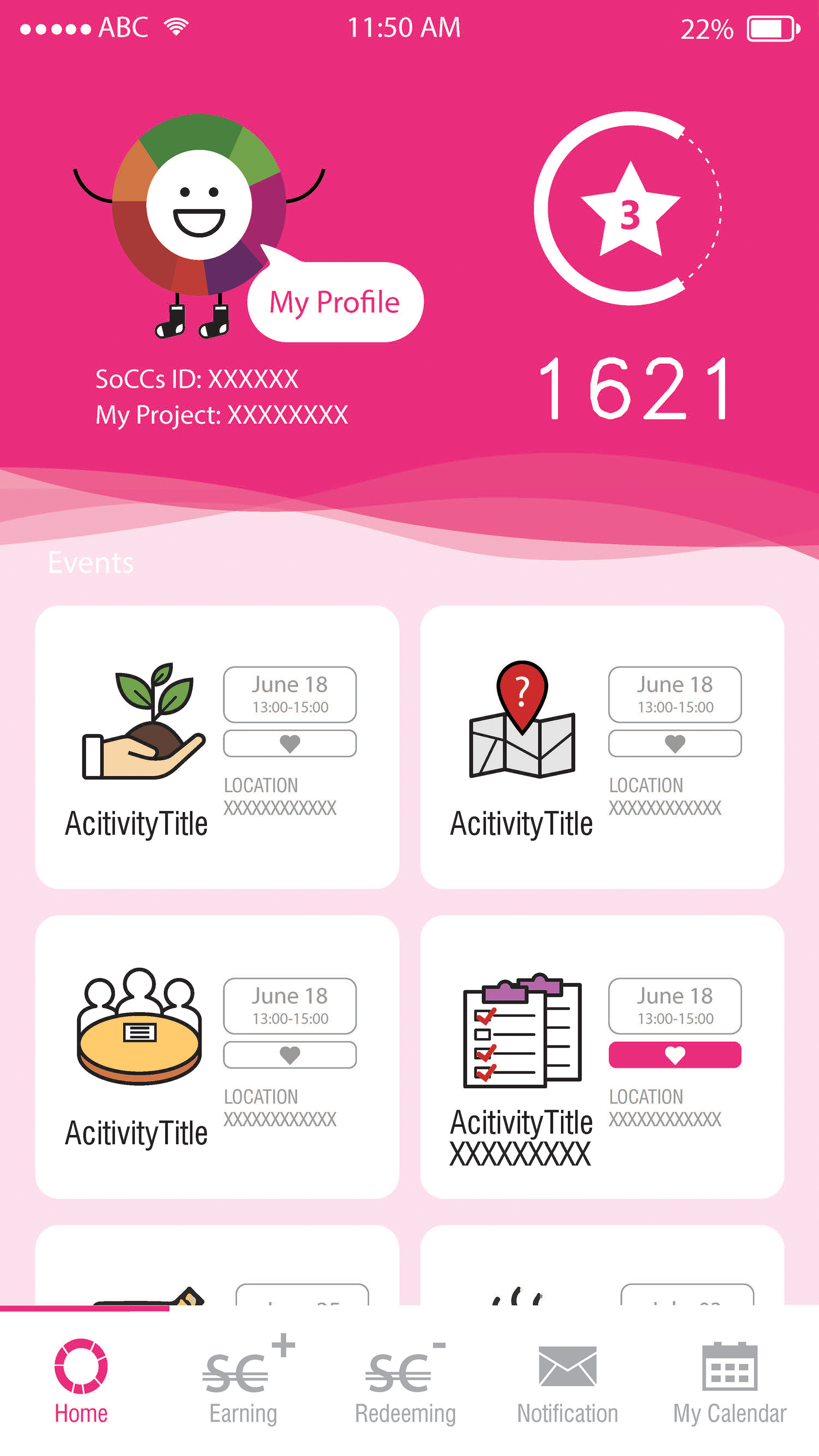
Dashboard
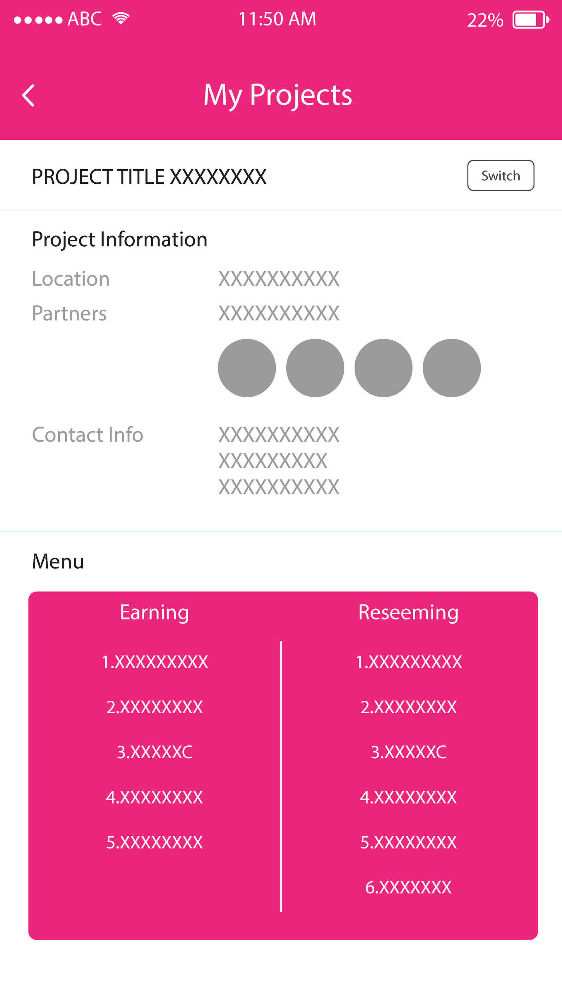
My Projects
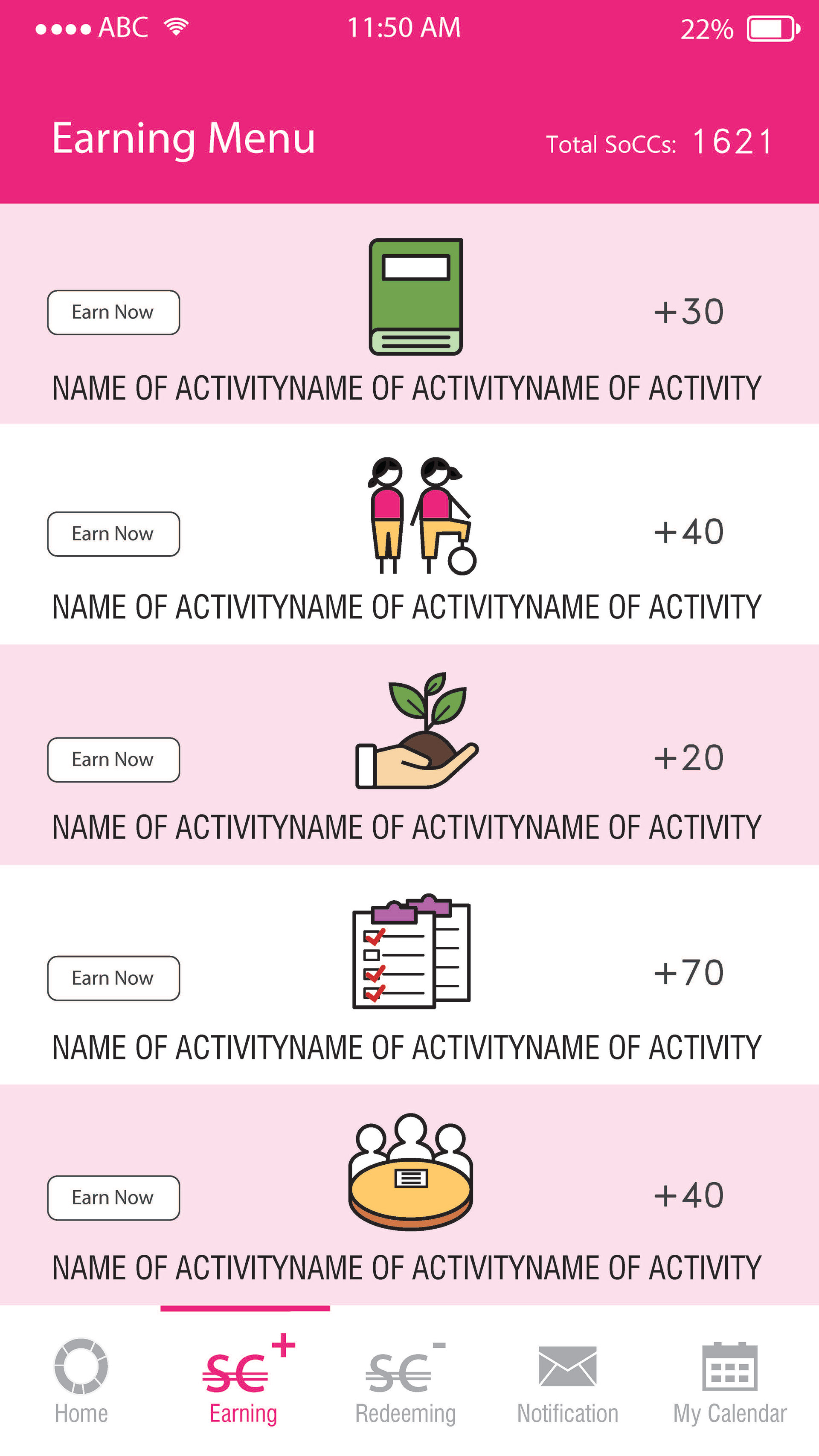
Earning menu
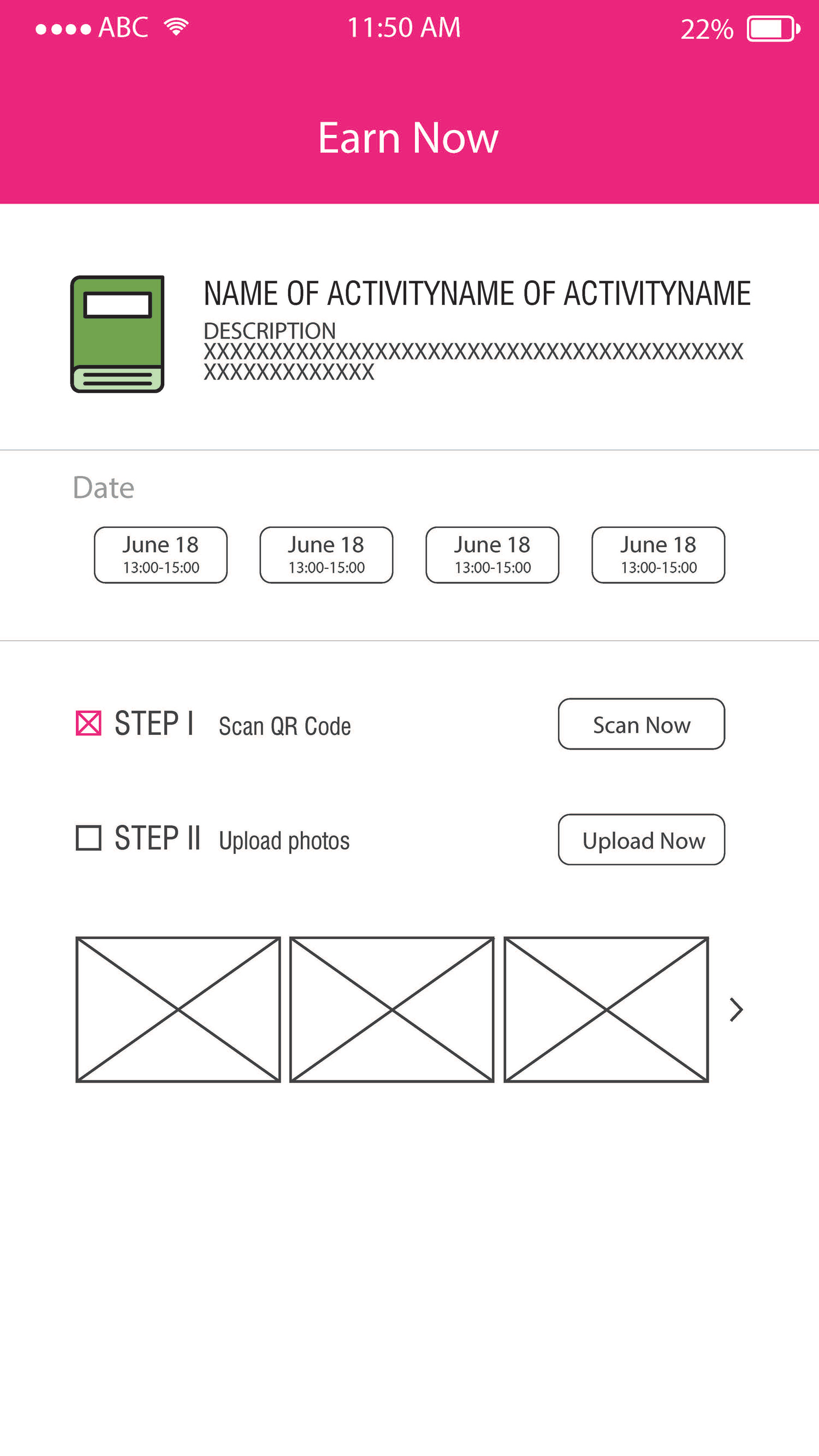
Earn now
USER FLOWS
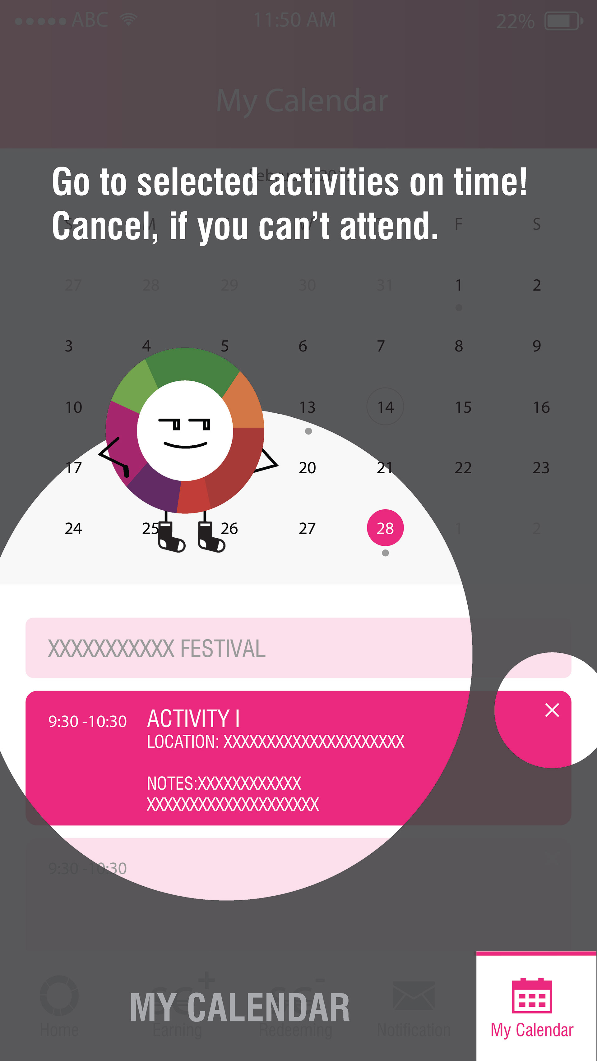
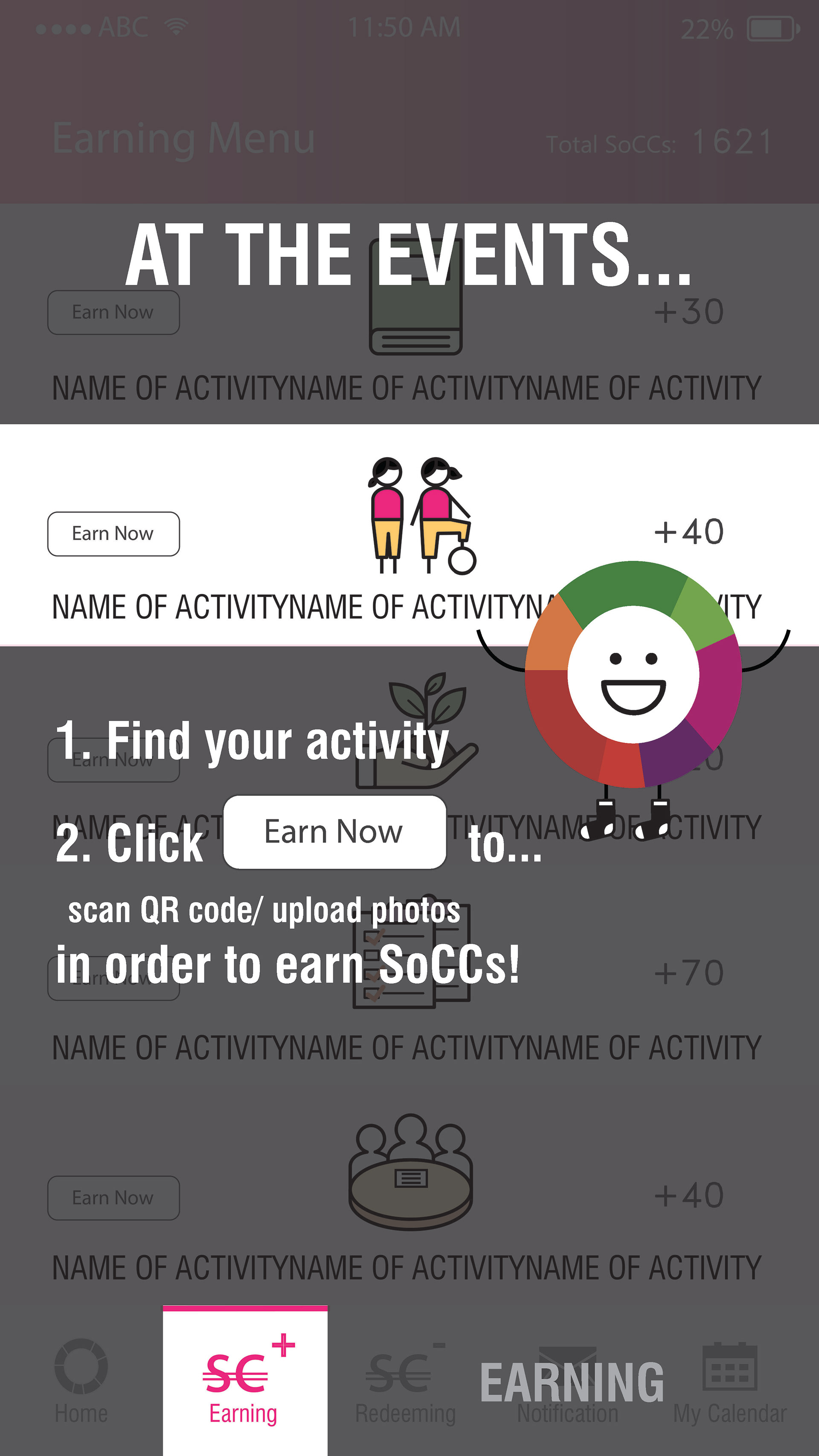
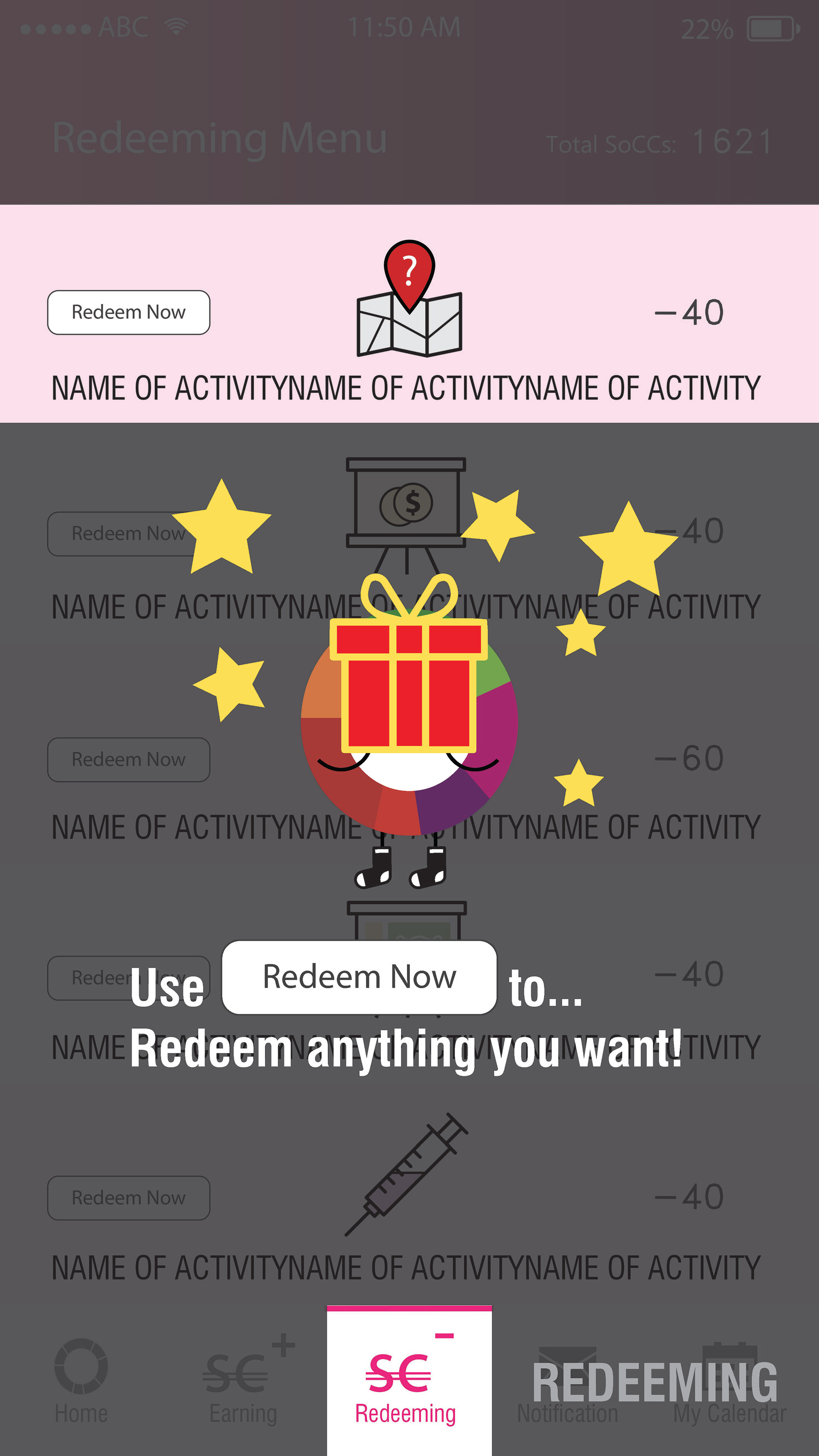
After creating mockups, we also created these user flows to understand various scenarios like for example participants/ communities could create projects within the SoCCs app with their own earning and redeeming menus. These user flows were later also used as marketing graphics to promote the use of app within communities.
REFINE
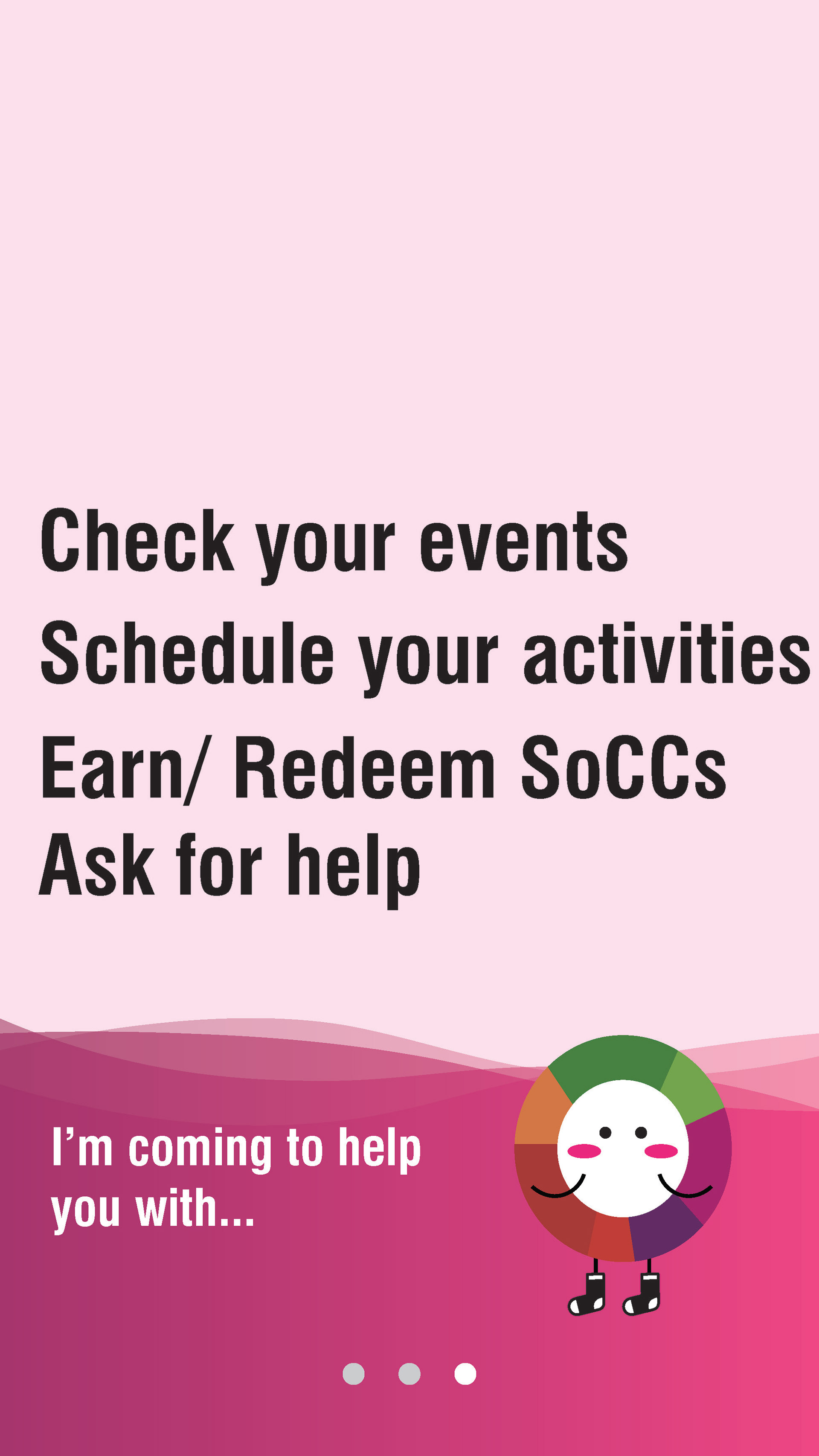
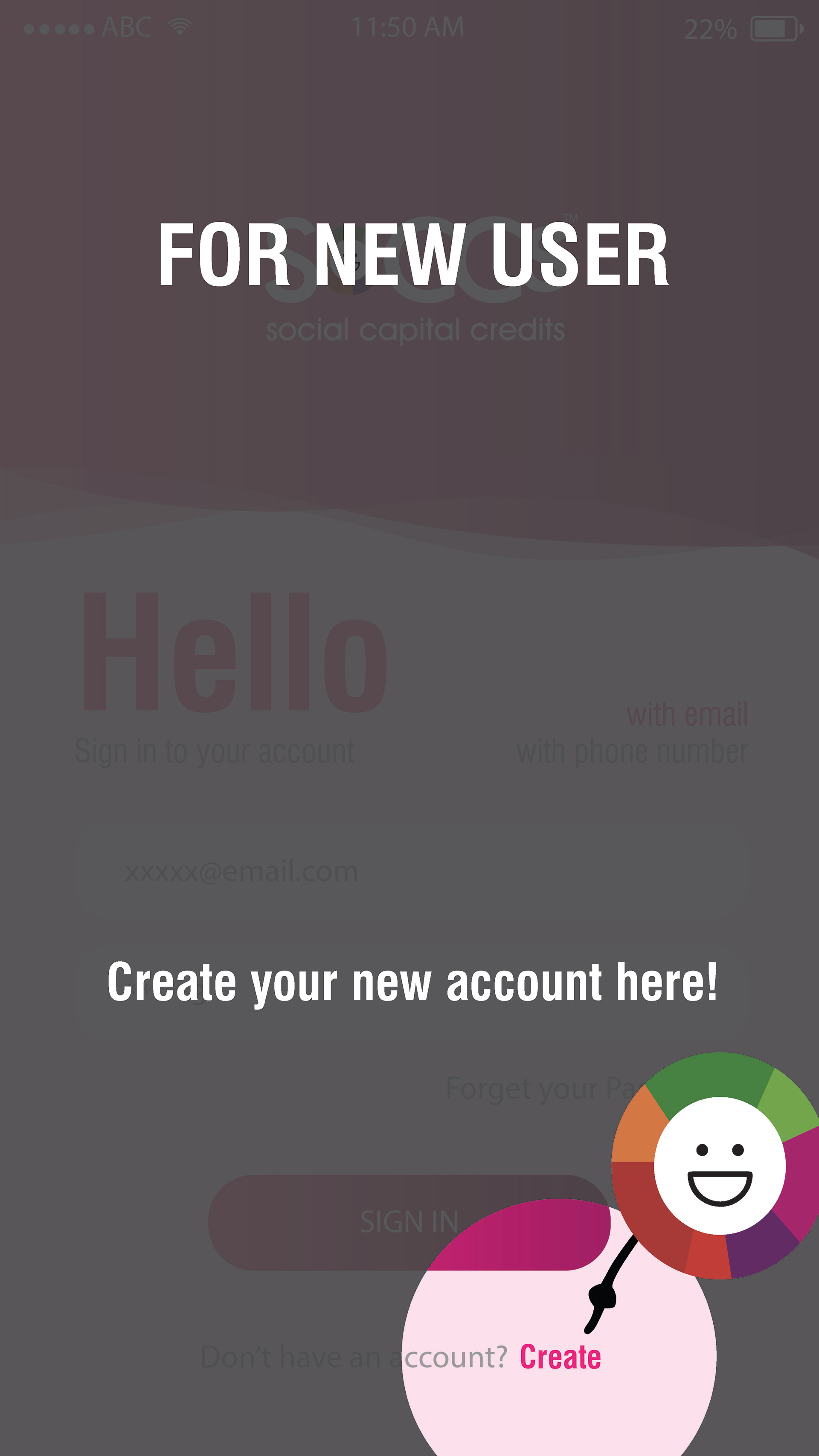
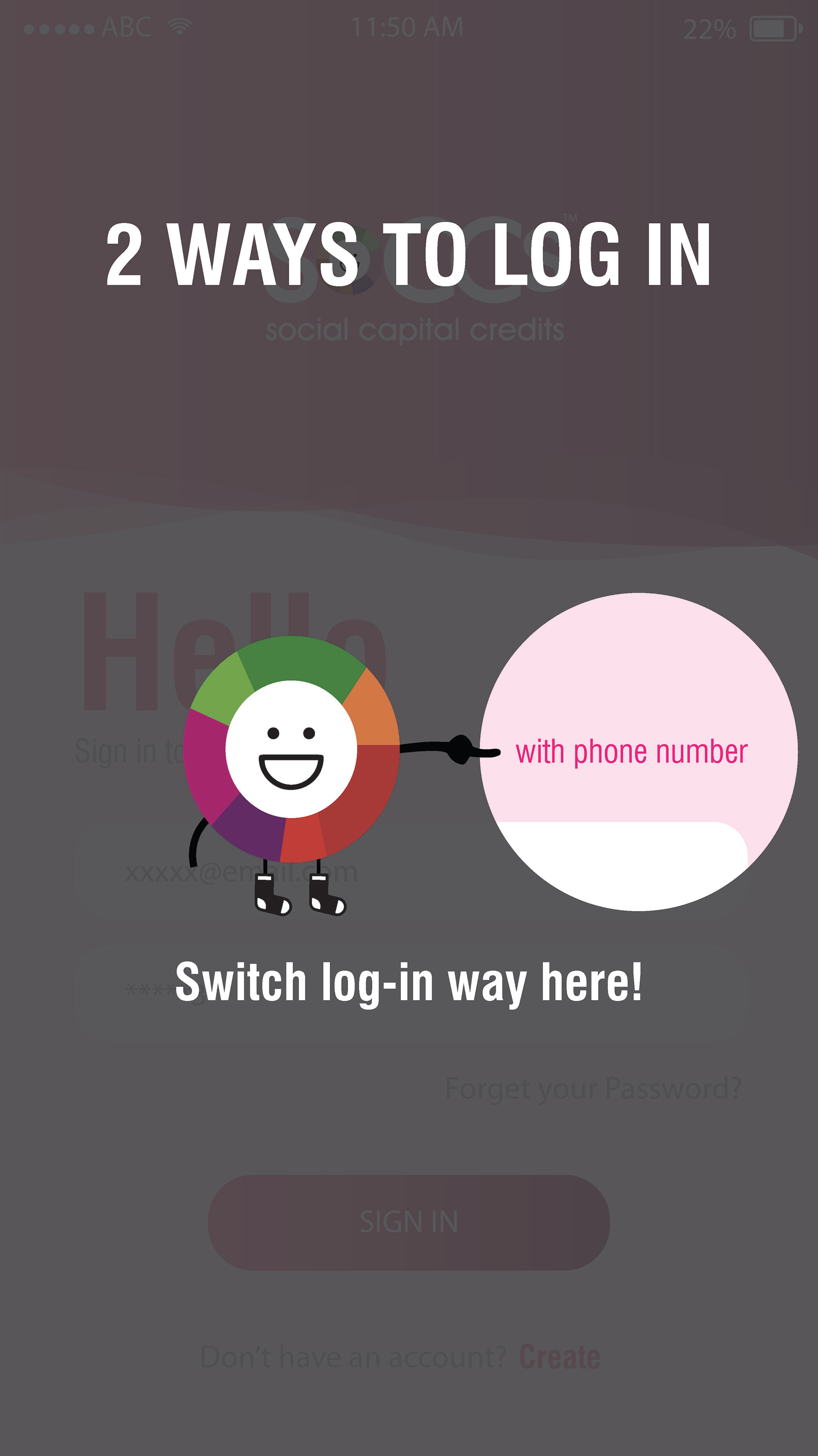
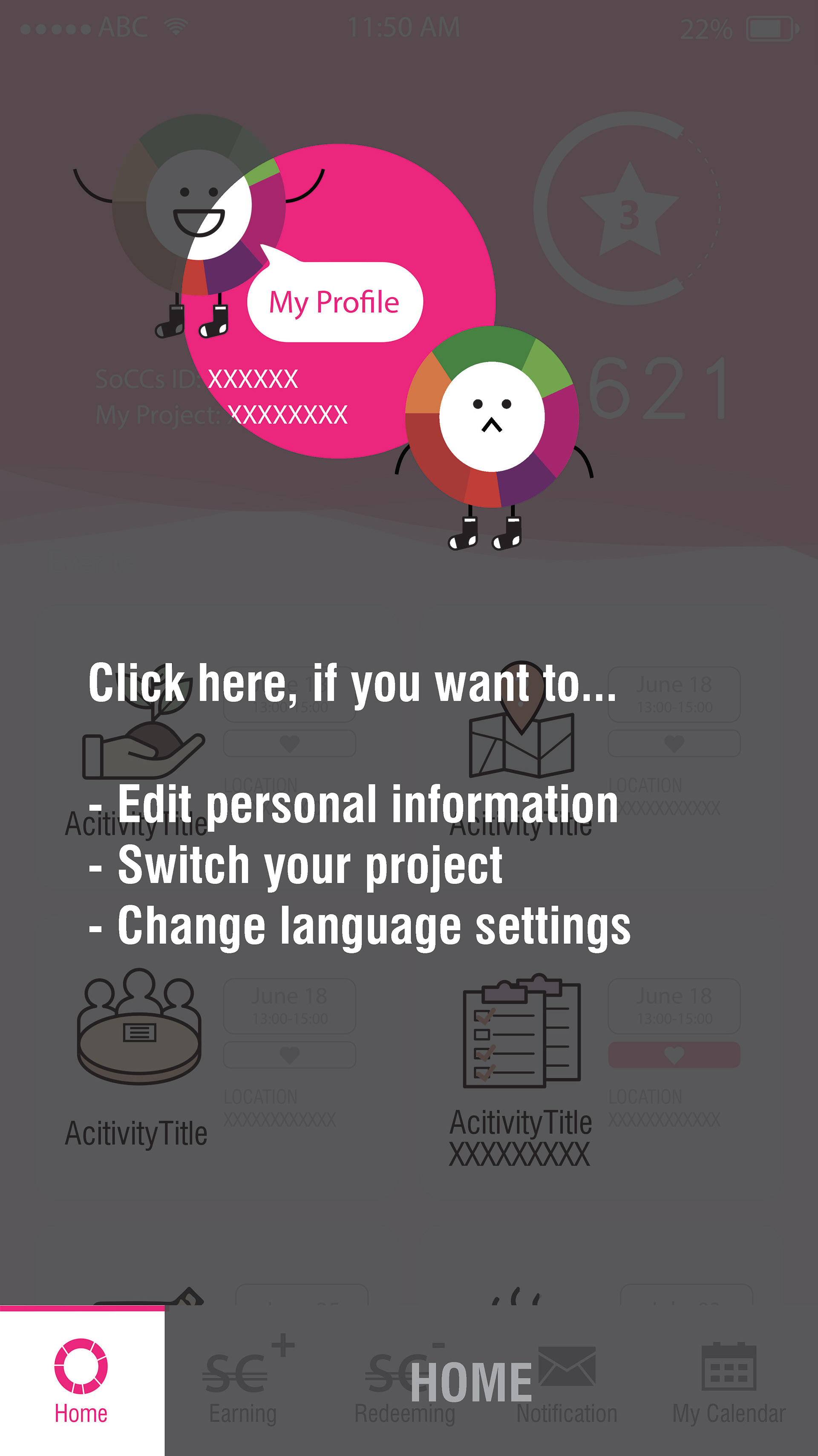
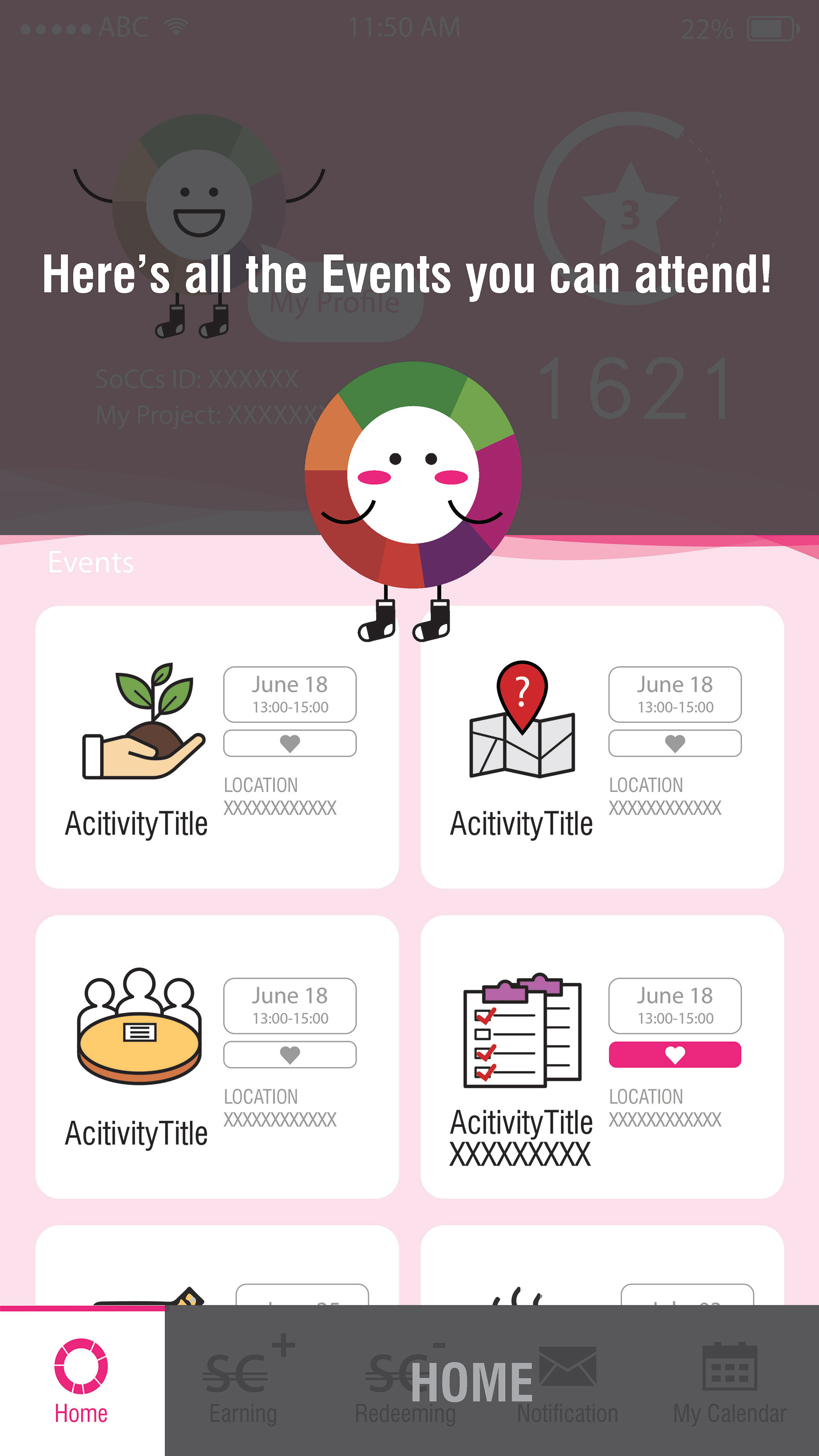
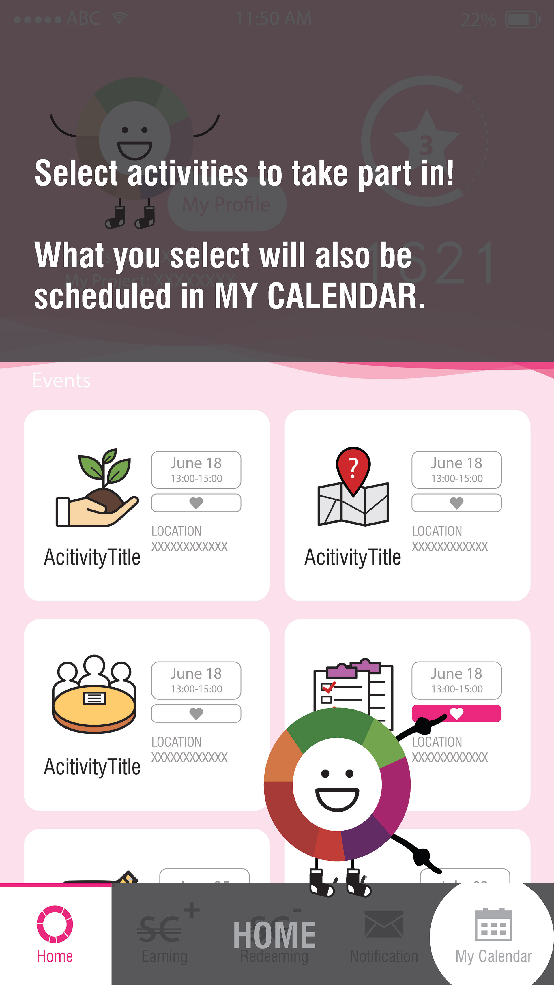
ONBOARDING EXPERIENCE FOR USABILITY STUDY
After creating mockups and HiFi Prototype, we created an onboarding process for our participants in the usability test. Following were our research questions :
•How long does it take for a user to select and complete activity from earnings menu in the app?
•Are users able to successfully redeem SoCCs for activities?
•What can we learn from the steps users took to earn and redeem SoCCs?
•Are there any parts of the earning/ redeeming process where users are getting stuck?
